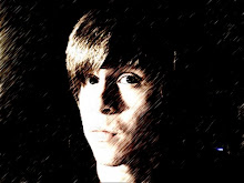
 Adrian Frutiger (March 24th, 1928 - Present)
He started as a 16-year-old printer's apprentice in Switzerland and ended as the producer of some of the most widely known and used typefaces available. As a graduate of the Zurich School of Arts and Crafts, Frutiger joined Deberny & Peignot typefoundry, where he worked on converting conventional type printing methods into more modern practices. Soon, he began to create his own original typefaces, many of which gained him world-wide recognition.
Frutiger's Fonts:
-President (1952)
-Phoebus (1953)
-Ondine (1954
-Meridien (1955)
-Egyptienne (1956)
-Universe (1956)
-Apollo (1962)
-Serifa (1967)
-OCR-B (1968)
-Iridium (1975)
-Icone (1980)
-Breughel (1982)
-Versailles (1982)
-Avenir (1988)
-Vectora (1990)
Frutiger's most notable font, however, is Univers. It is a new-grotesque, sans serif font that features a higher x-height and even stroke weight to improve legibility. This font was a breakthrough, as it was the first typeface to implement the numbering system (ex. 46 Univers, 45 Univers) as opposed to using names (ex. Bold Italic Universe). This system was spawned with the use of the Univers Grid, or a chart which documents the different variations of the font based on stroke weight and kerning. This system has helped to organize fonts in a way not before conceived. Not only was the system useful, but the font itself grew quite popular. With 27 different variations, it is one of the most adaptable fonts available. In the 1990's, Frutiger began to work with Linotype to produce a Linotype Universe family that contains 63 different weights, each one carefully drawn to be compatible with the other weights.
The Universe Family:


No comments:
Post a Comment