Typographic Rules and Terms
Wednesday, November 19, 2008
Wednesday, November 12, 2008

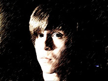
Barry Deck (1962-Present)
Ever since the invention of the printing press, type has stayed fairly consistent. It’s transition over the years from Old Style to Transitional and to Modern type has shown some evolution in what fonts we have today, fonts never really pushed the limits of structure for the longest time. In the 1980’s we really see the roots of a type revolution that comes to fruition in the 1990’s, simply called “New Wave” type. This decade featured type that really pushed the limits of structure and conformity within text, led by type designers who believed that not all text needs to be completely legible. At the forefront of this movement were a designer named Barry Deck and his simple yet incredible typeface simply titled “Template Gothic.”
Barry Deck was born in Mount Pleasant, Iowa in 1962. He was always a bit off as a child, and was quoted, saying that he spent most of his time “contemplating world domination while mowing the lawn.” (3) In college, he found his niche, graduating from Northern Illinois University in 1986 with valuable Visual Communications experience. He was soon recruited as
a junior designer for Lipmon & Simmons Company in Chicago. Soon, he moved on a job as a graphic designer at Kim Abrams Design. This opened doors for freelance work and Deck found many clients in Chicago, New York and Los Angeles. In 1987, he made the decision to return to his schooling and attended the California Institute of the Arts to get his Master of Fine Arts degree in Visual Communications. There, he was taught experimental and edgy approaches to design by instructors such as Ed Fella and Lorraine Wild. Barry would embrace this style of design, adopting it into much of his work. He graduated in 1989 and unleashed his edgy and distorted style into a rather conservative design community. He moved to New York in 1992, where he currently resides today.
Barry’s style of design features mutilated and irregular type and visuals, a concept not widely used in this decade. Style and music magazines embraced his distorted style and soon, his typefaces became a major influence on type designers in the 1990’s. "I am really interested in type that isn't perfect,” Barry said once in an interview. “Type that reflects more truly the imperfect language of an imperfect world inhabited by imperfect beings." He was published in many magazines, including Ray Gun, Emigré, Wired Eye, and I.D., where his typeface Template Gothic, called “the typeface of the decade” by Rick Poyner of Emigré magazine, began to receive recognition. It was inspired by letters drawn with plastic stencils, but uses rounder and more flowing strokes than usual stencils. Barry is tells us the story of how the thought up the typeface:

“There was a sign in the laundromat where I do my laundry. The sign was done with lettering templates and it was exquisite. It had obviously been done by someone who was totally naive. A few months ago, it was replaced with a plastic sign painted by a skilled sign painter. I asked them if I could have the old sign, and they gladly handed it over to me. Now it’s on the wall in my bedroom. I was inspired to design a face that looked as if it had suffered the distortive ravages of photomechanical reproduction. The resulting Template Gothic typeface reflects my interest in type that is not perfect; type that reflects more truly the imperfect language of an imperfect world, inhabited by imperfect beings.” (1)
Thus it refers to a process that is at once mechanical and manual, but was distorted into a hybrid. The co-founder of Emigré magazine recalls the story of the typeface:
"It was designed by Barry Deck while he was a student at Cal Arts in the early 90s. Under the auspices of Ed Fella and Jeffery Keedy there was a lot of exciting type design experimentation going on at CalArts in those days. I remember that particular graduate class came to visit our studio in '92 or so. That's when we first saw Template Gothic. We liked the font and asked Barry if he would let us release it commercially." (2)


Armenian type designer Hrant Papazian believes that Template Gothic should be partially credited to Ed Fella, instructor and mentor to Barry Deck’s design at California Institute of the Arts. He claims that the entire typeface was a digital version of a hand-made poster by Fella, only created by Deck because Fella sidestepped the use of a computer as a graphic designer. Yet, Deck receives the credit for this work, as he did do most all of the work designing it for computer usage. More than this, Barry has produced numerous other fonts during his freelance work such as Arbitrary Sans (1992), Barry Sans Serif (1989), Washout, Traitor (1997), Truth (1994), Fontoid (A font created solely for Nickelodeon), Canicopulus Script (1989), Cyberotica (1994), Caustic Biomorph (1992, part of FUSE 4), Cyberfriendly, Moderne Sans Serif, Mutant Industry Roman (1989), Bombadeer (1990), Industrial Sans (1990), FauxCRA (2002), Moderne Sans and Orgasm Heavy.
In 1995, Deck created his own company called Dysmedia (later renamed Barry Deck LLC), located in New York. Deck and Dysmedia has worked with several famous clients and are responsible for many of the contemporary iconography we see in advertising today. Deck’s website lists his services available by his company as: “Brand Identity Platforms, Brand Strategy, Visual and Verbal Brand Systems, Brand Guidelines, Activation of New Brands, Revitalization of Old Brands, On-Screen and Print Campaigns, Print Collateral Systems, Packaging Systems and Signage Systems.” The company has spent two years at Ogilvy and Mather’s Brand Integration Group (BIG), as well as a great deal of freelance work. Some of his more notable clients include:
+Coca-Cola
+Pepsi Cola
+Reebok
+Nike
+Apple
+AT&T
+Vodafone
+Heineken
+EA
+Dupont
+Sony
+Siemens
+Philips
+Charles Schwab
+Hewlett-Packard
+SAP
+Dreamworks
+Warner Bros.
+American Film Institute
+Universal Studios
+E! Entertainment TV Network
+Sundance TV Network
+PBS Public Broadcasting Service
+Nickelodeon
+Vh1
+Stalking Muses
+MoMA
+MoCA
+Conde Nast Publishing
+Atlantic Records
+City of Los Angeles
+The Getty Research Center
Barry’s company, under the auspices of “Barry Deck LLC” still works out of his office at 611 Broadway, Suite 710 in New York, New York 10012. Deck’s company works alongside Anita Lozinski and her own company, “Current Issue BV,” who is based out of Amsterdam.

In 1998, Deck got a job as the Art Director for Ray Gun magazine, a legendary grunge-design music mag. Deck invented the typeface Eu
nuverse in 1999 for Raygun magazine, giving their logo a distinct yet distorted look that defines the magazine. This font was created by flipping and rotating the gun logo, transforming it into the “r” in “Ray Gun.” Soon, Deck spawned an entire font from this concept. As the Art Director for Ray Gun, Deck learned how to create layouts and spreads with a very low budget. Every month, Deck had to oversee the designing of between 70 and 100 pages of content. This inspired highly experimental approaches in a very spontaneous design environment. Deck faced very strict deadlines when designing this magazine, as they did not receive advertising money if Ray Gun did not hit the newsstand on time. Ray Gun was a very cheap magazine, using inexpensive paper and never paying its illustrators and photographers. It was considered an honor to be published within its pages, not a commission. Ray Gun could provide great media exposure for any designers, illustrators or photographers looking for recognition. Ray Gun was a very adaptable magazine, and no strict layout structure was ever applied, as the aesthetic seemed to shift from issue to issue. The layouts were bold and interesting in their uniqueness, making this magazine very popular in the artistic community. With his trademark font on every cover, Deck was propelled to fame and recognition along with the growing magazine.
Barry Deck’s offbeat work has been published in numerous books as well as magazines. “The history of Graphic Design” by Philip Meggs. Contemporary magazines such as Wired, Metropolis, New York Times Magazine and Graphis all have featured his work within their pages. His art has even made it into the permanent collection at the Cooper-Hewitt National Design Museum in New York City. He’s traveled around the country lecturing and teaching his own unique version of design and typography. Perhaps he is not the most notable of designers, but his work greatly changed the direction that typography and graphic design was heading in the 1990’s, and a lot of the imagery and concepts we see in the media today has been affected by his hand. Barry Deck is ordinary man who became a designer and created something extraordinary. He is what every aspiring graphic designer and illustrator aspires to be after college: Someone who changes the world with a dream, a pencil and a simple font. In Deck’s own words: “He continues his effort to help fill the world with interesting, intelligent, idiosyncratic, ironic, beautiful and amusing stuff. And he has no lawn." (3)


Works Cited:
http://www.fontshop.com/fonts/designer/barry_deck/
http://www.papress.com/thinkingwithtype/teachers/type_lecture/history_template.htm
http://www.emigre.com/Bios.php?d=19
(3) http://www.identifont.com/show?1HV
(2) http://cg.scs.carleton.ca/~luc/usa-iowa.html
(1) http://emigre.com/EFfeature.php?di=125
http://www.cooperhewitt.org/EXHIBITIONS/archive/mixingmessages/essay/typo/t_b.L3.7.html